
NOTE: Throughout this guide, I am going to use Figma for demonstration. However, keep in mind that almost everything also applies to Sketch and Adobe Xd.
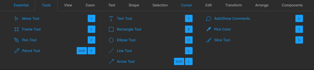
In part 1, I briefly explained each tools I found most important to start doing UI design. If you haven’t read it yet, you can do so here
This second part will be more specific in explaining how to create a ui design prototype from start to finish. However, note that everyone has a different workflow and that there are some parts that could be very useful to others that I won’t really talk about.
Starting off
Before we get into anything specific, I highly suggest looking at Figma’s (or Sketch’s) keyboard shortcuts and trying to remember some of them. It will speed up your workflow a lot.
 You can access this by hitting Ctrl+Shift+? inside Figma or by clicking on the hamburger menu on the top left of your screen, then ‘’Help and account’’, and finally ‘’Keyboard Shortcuts’’.
 The first thing you will want to do after opening up Figma or Sketch is to create a frame (or as Sketch calls it, an artboard) Inside this artboard is where everything is gonna happen. For this you can click on this little icon (see image below), or use the hotkey ‘’A’’ or ‘’F’’
Once you select that tool, you will have a couple of different presets of frame size for common interface dimensions on the right side of the interface. You have many choices depending on what you’re designing your interface for. For a mobile interface, I like to choose the iPhone 8 or iPhone X/11 frame. For desktop, I like to choose the frame conveniently called ‘’Desktop’’, which has a width of 1440 pixels. Height for me doesn’t matter because I’ll end up expanding it quite a lot, but it’s useful to know the approximate size of a page’s fold (the area of a website you see before scrolling).
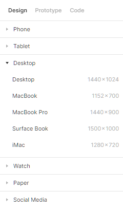 The different frame size choices in Figma
 Once you have your artboard created, you can start building your interface, but where do you start? I would recommend having either a very clear vision of what you want to do, or at least have made research and have found some inspiration prior to starting to work inside Figma or Sketch. For inspiration, I suggest looking at Dribbble, Behance and Awwwards. You can look on Instagram, Pinterest and others as well, but I personally prefer Dribbble, Behance and Awwwards to find inspiration with the latest design trends.
The Grid
So, say you already have a couple of websites or interface designs you found for inspiration (I recommend having a minimum of 3 or 4 different sources of inspiration, otherwise chances are you are gonna end up with something that looks a little bit too much like one of the images you took for inspiration). What I personally do before I start putting things inside that frame is to set a grid. To do this, you can select your frame (click on the frame name), then go over to the design panel on the right and click the + next to Layout Grid. From there you’re gonna have a couple of options. What I like to use is columns. I don’t use the grid or rows. I recommend using 12 columns for desktop as 12 is easily dividable and thus will give you good flexibility for your layout. You should use the columns to align your elements like images, text, buttons, etc.
 This does not show the column settings I normally use. They’re just what Figma defaults to. See below for column settings I use.
 This is what I prefer to work with, as I get a nice 1200px wide grid (see below). You absolutely don’t need to use these exact settings, by the way.
You can show and hide your grid layout by pressing Ctrl+Shift+4 on your keyboard.
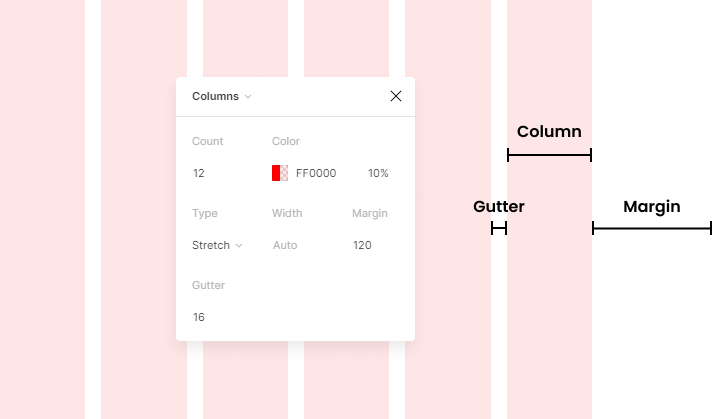 In Figma, I personally like to work with a grid of 12 columns with a margin of 120px on each side and a gutter of 16px between each column
 Wireframing or low-fidelity mockups
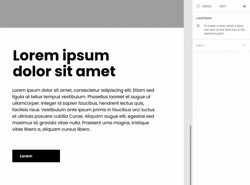
After that, I like to create some sort of quick ‘’wireframe’’ to get a sense of where I should put every element I need. I simply do this with rectangles (hotkey for a rectangle is ‘’R’’). I won’t add any color yet. This step is just to set the base for the layout, if you will.
You can choose a typeface you like (Figma has the complete library of Google Fonts built-in, so I suggest searching for one you like on fonts.google.com). For this one, I will use Poppins, a nice geometric sans-serif typeface. I will use a pretty large and bold font for titles (84px and 60px, Bold font weight) and decently large sized body text (18px, Regular font weight). Around 16px is usually a good size for body text.
You can use more than just one typeface if you want to, or if the typeface you chose does not work well as body text (e.g. it’s not easily legible). However, I strongly recommend using not more than 2 (or 3 in very exceptional cases). If you have two typefaces that are similar, you might want to use just one instead. Adding more typefaces is usually unnecessary.
After that, I’m gonna end up with something like this (see below). I would do the whole page like that, not just the header.
Also, it’s good to note that if you expand your frame, you will notice that some elements might follow or expand along with it. To go around that, hold Ctrl (or Command on Mac). This will let you expand your frame while leaving its contents untouched.
 A wireframe or low fidelity mockup using the 12 columns grid
 Normally, you should already have your body text so you would not have to use lorem ipsum. I like to use diagonal lines across the rectangles to show that there should be an image there. It doesn’t look pretty but it’s a good way to remember later on where I wanted the images to go.
Quick tip:
In Figma, what I like to do particularly with buttons is use the Auto Layout feature in Figma (sketch has something similar with symbols). To do this, create a rectangle and add text on top of it. Select both the text and rectangle layer, then go over to the design panel on the right side and click the + next to Auto Layout. What this will do is resize the rectangle depending on the text or elements you put inside of that rectangle. This way, you keep consistent padding in your buttons very easily throughout your design. You can use this trick with other things too, such as paragraphs, cards, etc.
Another quick tip
If you have an element that is going to repeat several times in the same page or over multiple pages, you can create a component (or symbol, in Sketch) for it. This will allow you to change all of the instances of that component while only having to edit the master component.
In this example, I have created a component for this navigation bar, because I know it’s going to repeat on every page. By copying that component, I create another instance of it. Now, if I edit parts of the original component, you will see the changes being applied to the other instance as well. If you wish to change something on one instance but not the others, you can simply edit that instance of the component. Changes won’t be applied to the other instances and the master component.
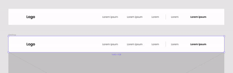 Master component is at the bottom. Instance of that component at the top.
 Making things pretty(er)
Now we can start making things prettier. We can add colors, images, textures, etc. For stock images, I recommend looking at Unsplash or Pexels. They have a vast library of high quality images that are completely free for personal and commercial use.
For this example, let’s say it’s a website for a hiking or outdoors equipment brand. I will use a nice bright apple green as accent color — because it’s closely associated with nature — and keep the background a neutral color (light grey and white).
I found a nice picture for the header. However, the text on top of it is very hard to read. A quick and easy fix for this is to add a black filter on top of it. You can do that by simply adding a solid black color on top of your image and reducing its opacity to around 40–50%
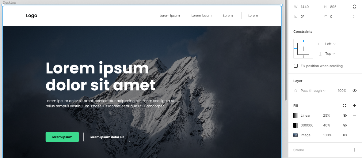 Adding a dark filter over an image will improve contrast with the text on top of it
 To further improve contrast, I also added a linear gradient over the image going from left to right, with the left side having a 25% opacity black, and the right side having 0% opacity black. This way, text is easier to read and there is very little noticeable change on the image itself.
More on buttons:
Ideally, you want to make your buttons big enough to be seen, but not too big that it’s the only thing you see. A good standard is to use 14px or 16px sized text inside the button, and then have between 24px and 36px of padding on each side, and around 16px of padding above and underneath the text. If your button was made using auto-layout, you can quickly change the padding inside the button in the design panel on the right, in the auto-layout section.

You might have noticed that I also rounded the corners of the buttons. You can do that by selecting the button (the rectangle, if the button wasn’t made with auto-layout) and changing the corner radius in the design panel on the right. A corner radius of between 4 and 8 is usually good enough for decently-sized buttons.
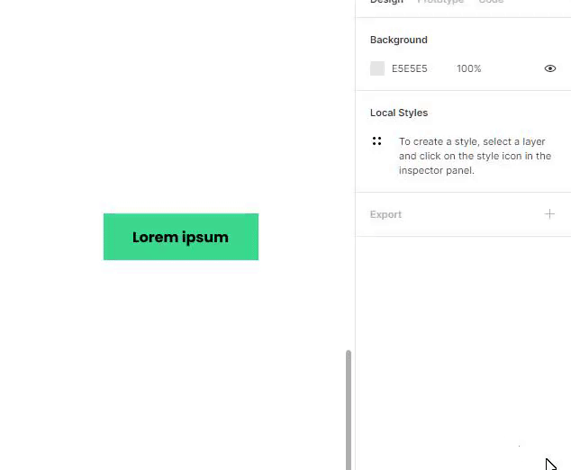 Rounding the corners of a button in Figma
 It’s usually good to have a button hierarchy too, because most of the time, you’ll have call-to-actions that will be more important than others, and you should show that visually as well.
In my header example, you can see that I have a primary button (filled with green) and a secondary button (outlined with white).
For more on button hierarchy and ui design tips, I suggest reading this article by Adam Wathan & Steve Schoger on Refactoring UI
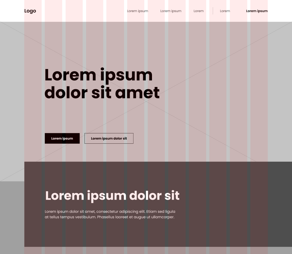
End result
Before you consider your design finished, you need to make sure there’s good flow between each section and that there’s enough white space. I personally like to keep a distance of between 108 pixels and 180 pixels between each section of a page. I will also generally leave more white space on a dark background than on a light background.
You should also make sure that padding is consistent throughout your page. In my example, I used a space of 32 pixels between each title and body text. I also made sure that all of my titles and body text had the same font size, weight and line height.
Generally, 150% line height is good enough for body text. Too little or too much and it will be hard to read. In Figma you can simply put 150% in the line height field in the text settings in the design panel on the right.
I also turned down the opacity of the body text slightly. I generally like to keep my body text at around 75% opacity black. This usually helps with hierarchy, along with font size and weight.
I also decided to add textures (the green patterns) to fill some of the empty spaces and add some visually interesting elements to the page.
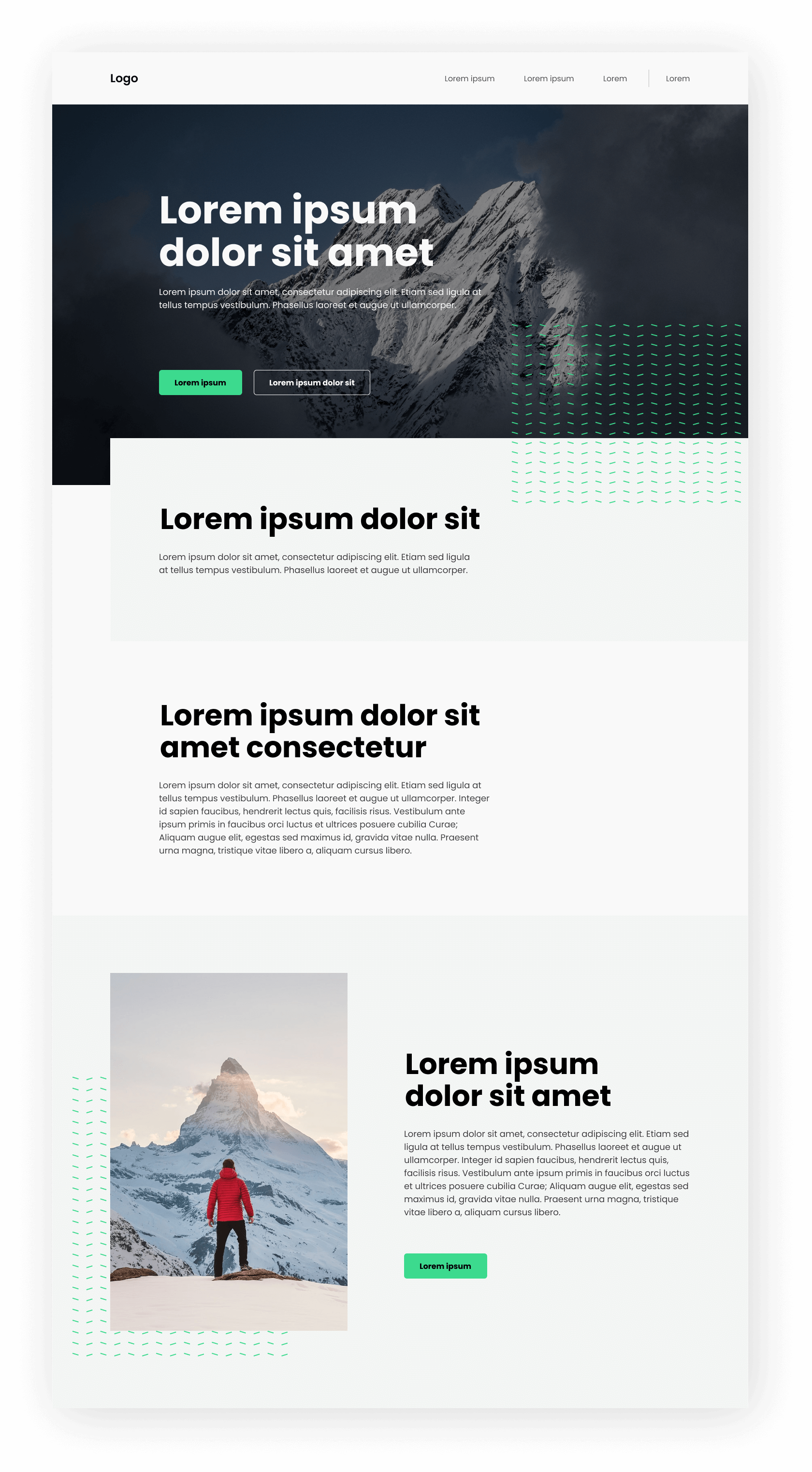
My example is far from perfect. It’s missing a lot of important elements like copy text (obviously), call to actions, actual navigation, a footer and maybe some elements to fill the empty spaces. Regardless of that, I hope this was able to help you get started with Figma!