
TIP #1: Don't use the default text settings
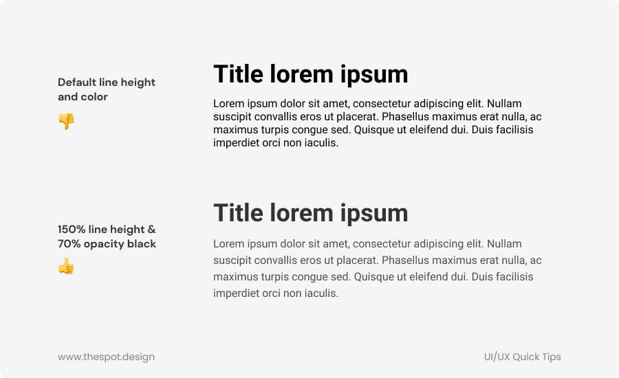
I see quite a lot of people (especially beginners) simply use the default line height for their body text, and default color (often black #000000). It's usually kinda obvious, especially when it's Roboto.
A good trick if you use Figma is to put 150% in the line height field for your body text, and use a dark grey color (or black at 65-70% opacity. This is ideal if your text is on a colored background).
For titles, between 100% and 120% line height works well.
If you use Adobe Xd or something else, simply do 'font size' x 1.5 (or 1.2 for titles, for example) for the line height.
So if you have 16px body text, line height would be 24.
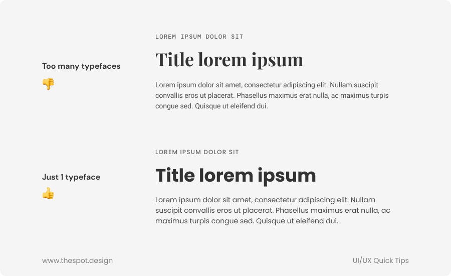
TIP #2: Don't use more than one or two typefaces
There is rarely a need to use more than one or two typefaces in a project. Using one (or two) different typefaces will make your design look more unified and more consistent. If you want to use a second typeface, choose one for titles and one for body text. You should also choose two typefaces that are different enough.
For example, if you choose a sans-serif for your titles, you could choose a serif typeface for your body text.
If you have a project with two similar typefaces, consider using only one, and use the different weights of that typeface to create contrast and hierarchy.
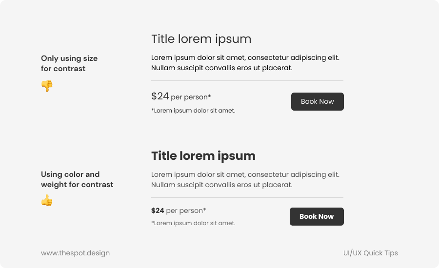
TIP #3: Use color and weight for contrast
Instead of only using size for contrast in an interface, use different colors and text weights.
For example, using bold text for titles, and a lighter grey for body text will help give more contrast to the title, making it stand out more.
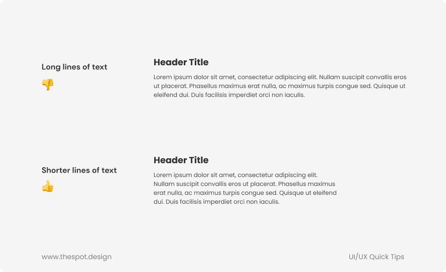
TIP #4: Shorten the length of your text lines
Having long lines of text makes reading more difficult. The more characters there are in one line, the harder it is for readers to stay engaged.
As a rule of thumb, keep your lines of text no longer than 40 to 60 characters.
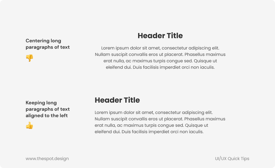
TIP #5: Avoid aligning paragraphs of text to the center
Text aligned to the center or to the right is harder to read than text aligned to the left, because the start of the line is always different from one line to the next.
It's okay to center short bits of text, but as a rule of thumb, it's better to keep text left-aligned.
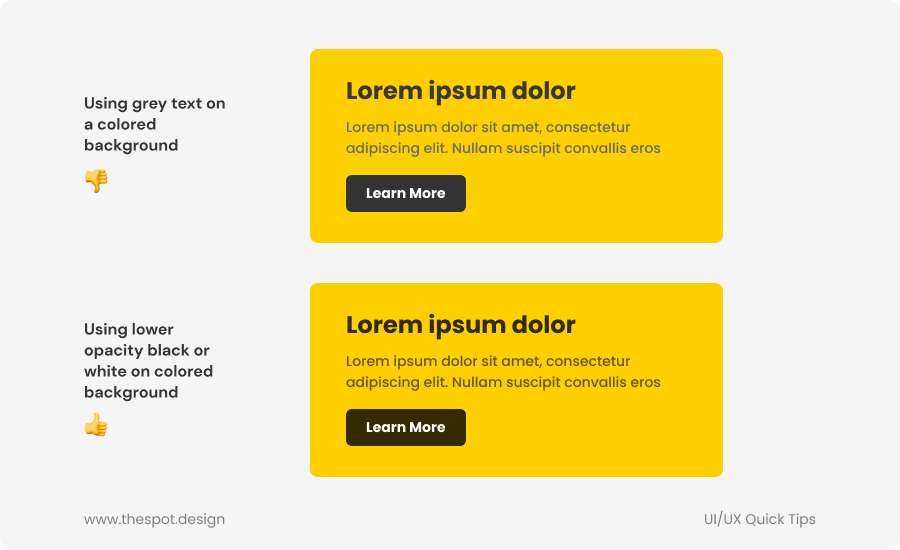
TIP #6: Use lower-opacity black or white on colored backgrounds
Instead of using a lighter grey for your text on a colored background, consider using lower opacity black or white (around 60-75% opacity).
This will give your text more of the color of the background, rather than making it grey and muddy.
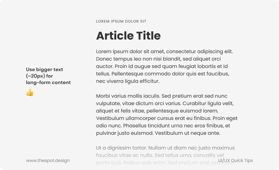
TIP #7: Use larger text for long-form content
For long walls of text (e.g. blog, article, etc.) consider increasing the size of your text to around 20px. This will make text easier to read and long paragraphs of text easier to digest.
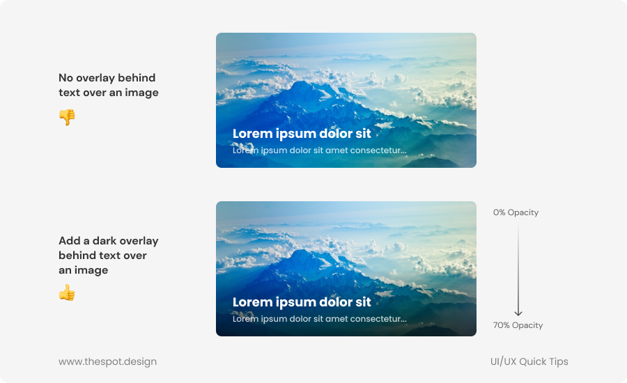
TIP #8: Add a dark overlay behind your text over an image
When adding text over an image (in a card or on a header, for example) consider adding a dark overlay behind your text to improve its contrast and legibility.
This can be done by simply adding a linear gradient from top to bottom in front of your image (0% opacity black to ~70% opacity black).
You don't always need to cover the whole image. If you have long images with text at the bottom, you could start your gradient in the middle of the image or lower, and end it at the bottom.
TIP #9: Give your buttons proper hierarchy
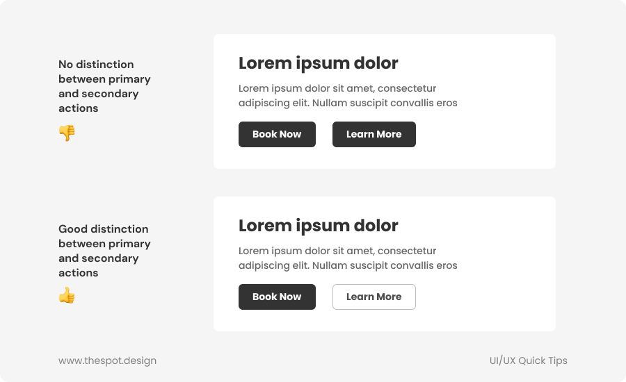
Giving your buttons proper hierarchy will make it clearer to the user what the primary actions are, this will make navigating the interface easier and clearer. Primary actions should be obvious, secondary actions should also be clear but not as prominent, and tertiary actions should be clear but unobtrusive.
For example, you could have a header with two call-to-action buttons. One should probably be the primary action, and the second one should be a secondary action (e.g. ''Book now'', and ''Learn more''. ''Book now'' is the primary action, and ''Learn more'' is the secondary action. They should be displayed as such in your design). Generally, try to avoid having two buttons with the same hierarchy level next to each other.
Destructive actions shouldn't always necessarily be a big red button. If the destructive action isn't actually the primary action, it might be better to give it a secondary or tertiary appearance. You can save the red destructive button for cases where it actually is the primary action (e.g. on a modal to confirm the removal of something ''delete'' would be the primary action, and ''cancel'' the secondary action.
Keep the same style for your buttons
It's also important to keep the same style for all your buttons. If you go with rounded corners, keep that style for every single button. You should also keep the text size and padding the same for every button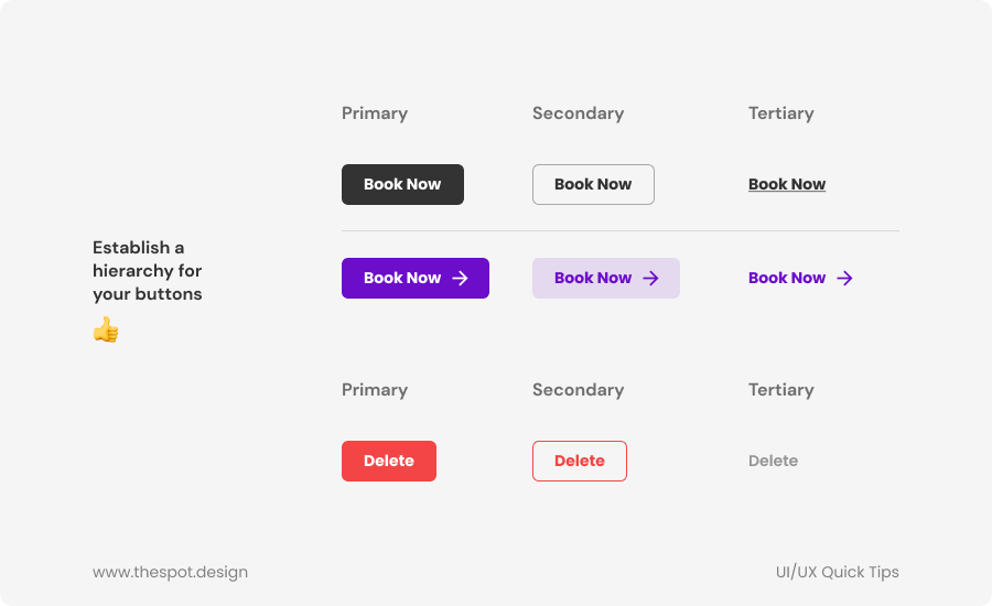
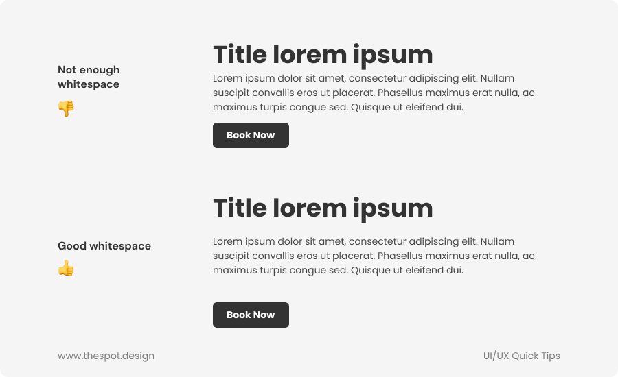
TIP #10: Give your text and other elements proper white space
Whitespace is vital in UI design. Proper spacing will make it more obvious what content and information is grouped together, and what isn't.
It's also very important to give your text and your other elements proper breathing room.
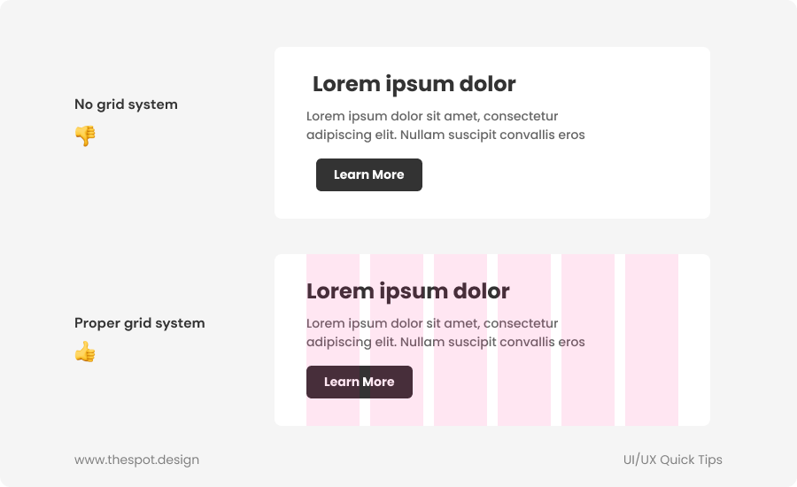
TIP #11: Use a grid system
Using a layout grid system (for example, columns) will help make your UI design a lot more structured and solid.
For desktop, it's most common to use 12 columns. This is so that it can be divided into 2, 3, 4 and 6, which is useful to create lists or more dynamic layouts.
For desktop, I personally use 1440px wide artboards and a 12 columns grid layout with 120px margins and 16px gutters.
Use those columns to align your elements and to keep your content within those columns.
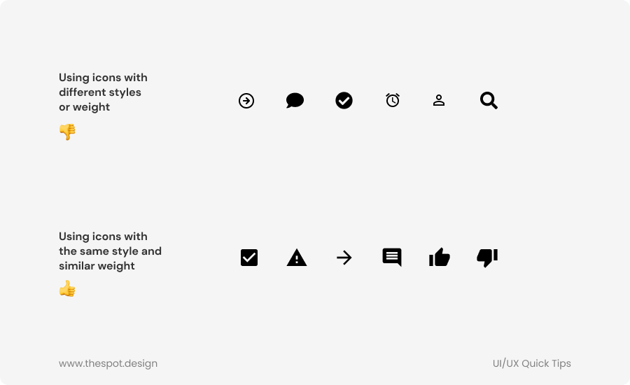
TIP #12: Use icons of the same style and of similar weight & size
Choose one style of icons and stick to it. For example, you can choose to use outlined icons, or filled icons, but it's best to stick to that one style throughout your design.
Make sure the line weight of your icons is similar, and that the size of your icons is similar as well, or at least proportionate.
To ensure this, it's sometimes best to use one library of icons (e.g. Feathericons, FontAwesome, Material Design icons, etc.) instead of taking icons from different packs.
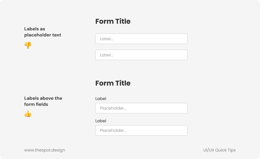
TIP #13: Keep your labels above form fields
It's recommended when designing forms to keep labels above form fields so they remain visible even during and after a user is entering information in the input field, whereas the label would disappear if used as placeholder text inside the form field.
Putting it above the field ensures it's always visible.
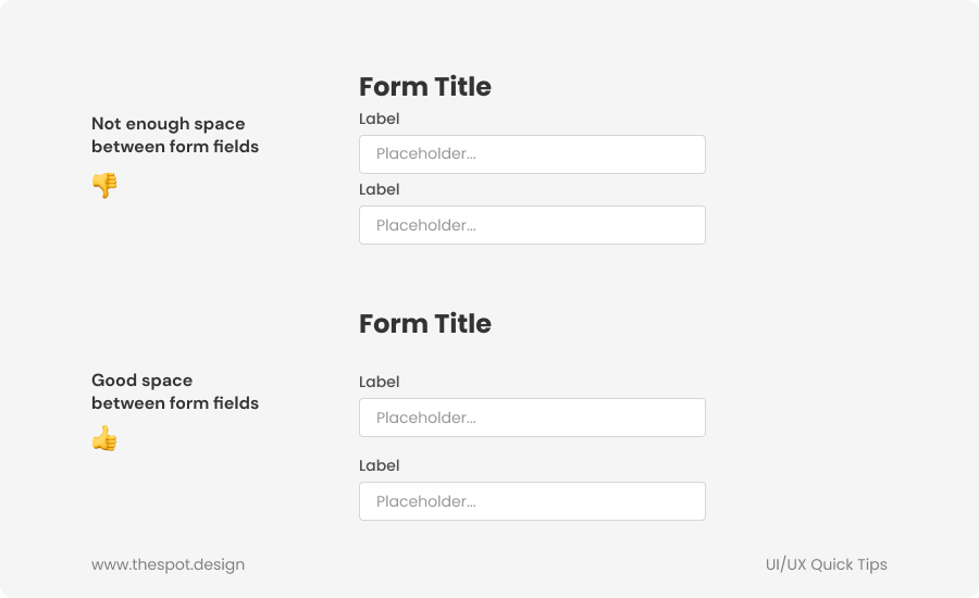
Tip #14: Leave enough space between form fields
Leave enough space between each form field so it's clear what field a label relates to.
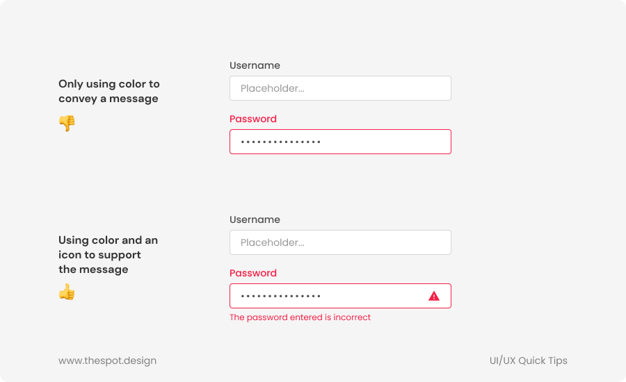
Tip #15: Don't rely only on colors
Don't rely only on colors to show important messages such as errors. Colors aren't always clear enough, and doing this could also cause issues for colorblind people. Don't assume people will understand what a color means, or that everyone will be able to see it as intended.
Instead, use icons and messages to support your colored message or element.
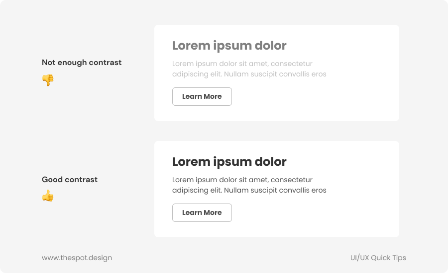
Tip #16: Contrast is important!
Contrast in design is very important, so it should not be an afterthought. You should always make sure your elements have proper contrasts, especially text.
There are plugins that can help check contrast, such as Stark or Contrast for Figma.
Tip #17: Skip a weight
To create contrast between your bold and regular text, it's generally recommended to skip a weight. For example, if you're using Regular text and want to put emphasis on a title or a string of words inside your text, skip the Medium weight and use SemiBold or Bold.
Tip #18: Make a distinction between primary and secondary actions
Always make it clear which button represents the primary action and which one represents the secondary action, and avoid having two buttons of the same level side by side.
Tip #19: Primary action at the bottom on a vertical layout
Since we read or scan from top to bottom, when you have two actions next to each other, it's generally better to have your main call-to-action at the bottom of the screen on vertical layouts, such as mobile screens.
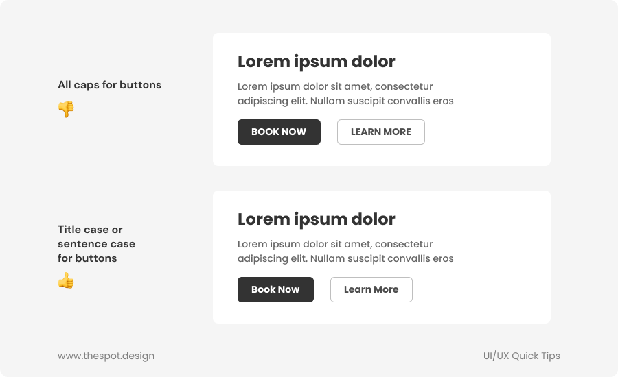
Tip #20: Avoid all caps in buttons
For button copy, it's recommended to use title case (capitalizing the first letter of every word) or sentence case (capitalizing the first letter of a sentence), and to avoid all caps, as it's often harder to read.
Generally, title case is preferred for buttons.
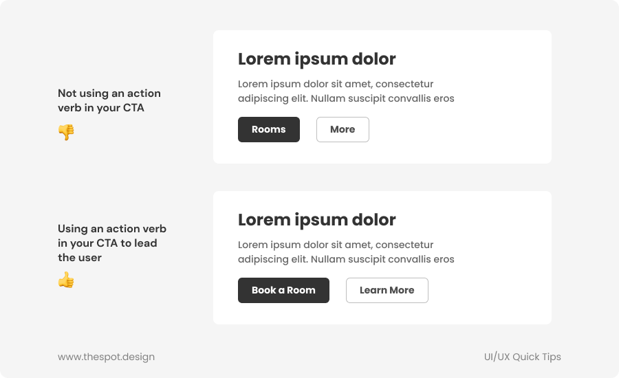
Tip #21: Use an action verb in your buttons to lead the user
Instead of using simple nouns that don't lead the user to take action, or that are confusing, use a clear action verb in your CTA like ''Shop Now'' or ''See Our Products''.
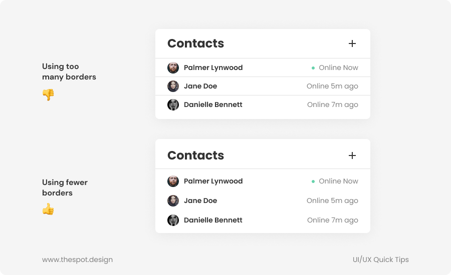
Tip #22: Use fewer borders
Borders can be useful to separate information, but they aren't the only way, and can very easily make a design look cluttered. A simple alternative is simply to increase the spacing between each element by a few pixels, so groups of information are clearly separated.
Another alternative when designing a table is to make every other line a slightly darker shade, instead of using borders.
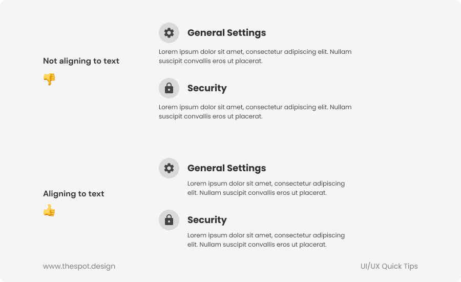
Tip #23: Align to text
Align your text to other text to make things easier to read and navigate as it keeps the reading line consistent.
Tip #24: Make your icons lighter than the text they're with
When adding icons next to text and when the icon is heavier than the text, it's a good idea to lower the opacity of the icons, or to make them slightly lighter than the text. This is to avoid the icons standing out too much and overpowering the text.
It does not need to be too noticeable, but making icons that are heavier than the text lighter will help keep the visual balance.
Tip #25: Avoid standard bullet points
Don't be afraid to stylize your bullet points list, instead of using simple and boring bullet points. Using generic icons like a checkmark or an arrow can help make your design more visually interesting.
Tip #26: Increase letter-spacing for all caps text
Since all caps text is harder to read, it's recommended to increase its letter-spacing to improve legibility. A letter-spacing of around 1.2 or 1.4 (12% or 14% in Figma) instead of 0 for all caps text can help make it easier to read.
Tip #27: Avoid making your UI look like a database
Instead of showing information taken from a database in a straightforward list, try to create a more visually interesting way to display things. Establishing proper hierarchy with size, weight and color, and using visual support elements such as icons is a simple way to make your UI more visually appealing and lively.